
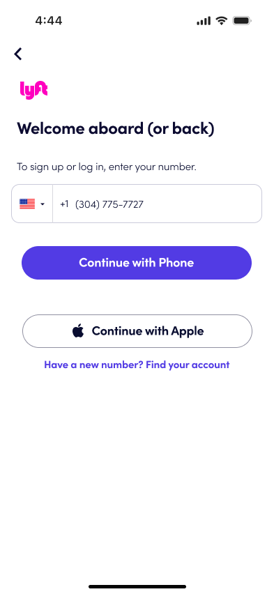
Lyft
Adding a Feature

Background
On a family trip to Hawaii, I realized we had too much luggage to fit in our Lyft. Although we had requested an XL, the car was still not large enough to accommodate us. This experience made me think about the user experience when choosing a car on Lyft, so I decided to investigate further.
Problem
Currently, there are several options when requesting a car, but the passenger is extremely limited in special requests. I aim to add a feature that allows the rider to customize their trip, increasing the app's ease and expanding customer satisfaction.
Solution
To create a new feature for the existing Lyft app that lets users customize their rider experience. After answering a few short questions, Lyft can more accurately choose a car. This feature will also improve the process of planning a future trip.
My Role
End-to-end UX & UI Designer
Timeline
80 Hours
Tools
Figma, Google Suite, Maze, Canva
Empathize
Secondary Research
During this phase in my process, I assumed that users would want to alert drivers of pets and extra luggage. I spent some time researching rideshare apps that already existed and learned a few things. UberPET has been around for years in some cities but has experienced a slow rollout. When it comes to the size of the car, UberXL is an effective way of ordering a larger car to accommodate more people, but there is no way to specify how many people you have. Vans are no longer approved for UberXL, despite vans being able to accommodate many riders and their luggage. My final key takeaways were that Uber Security is buried in the app and Uber has more developed safety features than Lyft.
Survey At a Glance
18 participants
Majority aged 25-34
About 2/3 of the survey participants were women (12)
The majority of the people who took the survey lived in Reno (7)
Most people who took the survey access the internet on their mobile phones 77.8% (14)
How often do you use a rideshare service?

Have you had trouble fitting your luggage in the car?

Have you ever brought your pet in a rideshare car?

Key Takeaways
All of the participants use rideshare at least 1 - 5 times a year, with the majority using rideshare more than 16 times a year (7)
Most participants use Uber as it is more available in the city they live in
All of the participants have used rideshare to get to and from the airport (18)
Most users have no trouble fitting in a car, but some do
Ease of app use and availability of a car are the top two reasons users choose one rideshare service over another one
The top two reasons users use a rideshare service are to get to or from the airport or to get home from a night out
Interviews
I did four 1-on-1 interviews with a range of rideshare users. I conducted the interviews via Zoom, allowing me to take detailed notes and create a report with my users. Almost everyone living in an Urban environment has used a rideshare app. I wanted to investigate the pain points of using a rideshare app and determine when users are most likely to use an app at all. It was also crucial to my research to determine which app users used most and if they believed one was lacking as apposed to the other.

Key Takeaways
Luggage space is a concern for users
Users traveling with family and carrying a lot of luggage have experienced issues fitting into a car
Users traveling alone with oversized luggage, such as golf clubs, have experienced issues
Safety is a major concern of users, much more so than the survey results showed
Pets are not a concern of rideshare users, and most have never used the “pet” feature available on Uber
Users are willing to wait longer for a car if they know it will match their needs, but not too long
The focus should be on extra space for luggage or safety concerns.
“Why would I want to waste 10 minutes playing Tetris with my luggage when I could have just planned to wait 10 minutes longer for the car that would fit everything”
Define
User Persona
I created one user persona to cover a person traveling alone without kids (perhaps for work) and traveling with their family. I used the persona to emphasize the pain points, including space concerns when traveling alone and with their whole family. I also wanted to emphasize the needs I discovered through research: an easy way to request a car that is large enough and to alert drivers as to why. This created a visual for me to continue moving forward with the design.

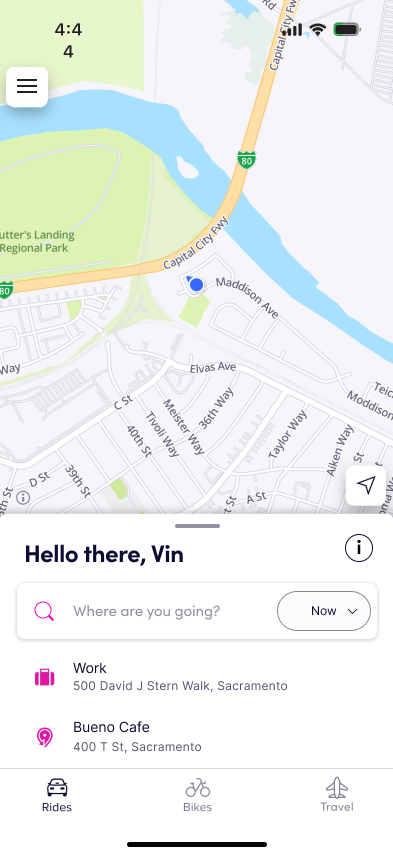
Site Map
I created a site map to lay out the current organization of the Lyft app. It helped me to visualize where the added feature could be located within the current structure. The Lyft app is rather straightforward, with only three main navigation buttons on the bottom of the screen. Navigating the app is done mainly by clicking from one screen to the next during ride selection. The added feature will likely need the same click-through design to integrate it into the existing app.

User Flows
User goes on Lyft to plan for a ride from the airport to the hotel with 4 passengers, 3 large bags, 2 medium bags, and 2 personal bags
I created two user flows with similar scenarios. The goal was to test how the new travel feature would work. The first flow was for a user traveling alone with extra-long luggage - golf clubs. Golf clubs were specifically mentioned as something that does not always fit during my research. The second flow was for a family of four traveling with multiple bags. The flows showed that there would be alternate paths to the travel feature, but they would ultimately end in the same place. These flows helped me determine how the feature needed to function for the final MVP.

Design & Ideate
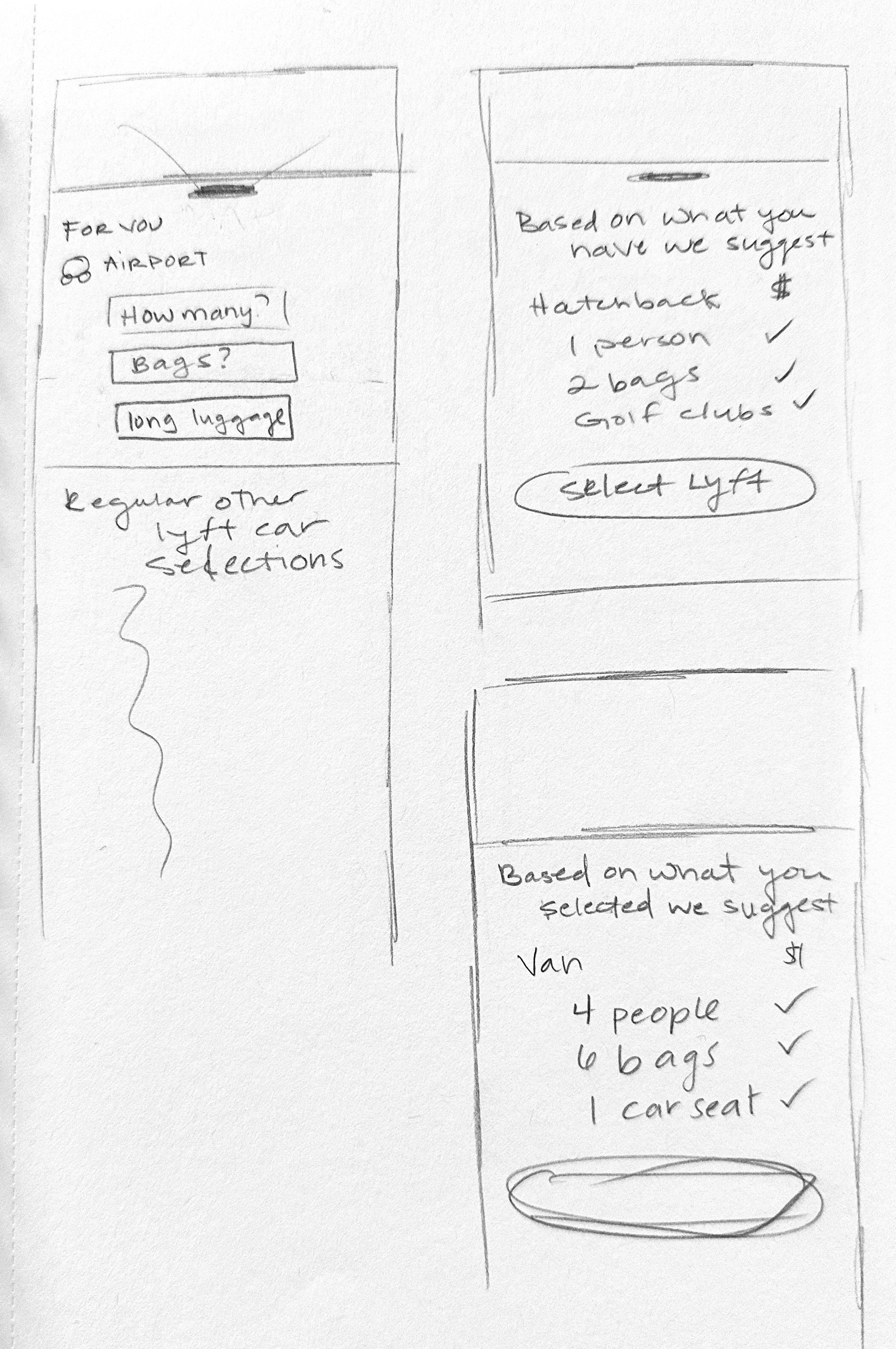
It Starts With a Sketch
The sketching process was interesting with Lyft, as I had to try to forget the current layout and design and start from scratch. At the same time, I had to remember that I was integrating the added feature into the existing design. The best way to do this was to keep sketching and try to develop as many ideas as possible. Eventually, I gravitated towards a click-through design that would allow you to use check boxes that would alert the driver to the user’s needs.


UI Kit
I could pull the colors for Lyft straight off the screenshots and implement those as color styles for the project. I researched to find their font styles as well as button styles. I then created a UI kit to apply the styles across my wireframes easily.

Wire Frames
As the Lyft UI elements already exist, my wireframes started with a higher fidelity than usual for this project. I found it harder to create black-and-white frames when the full UI elements were at my fingertips. I copied screenshots to help make the necessary screens and recreate the UI kit.


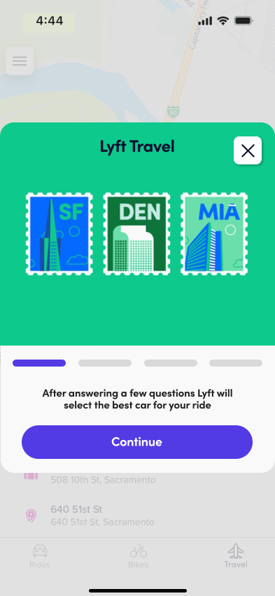
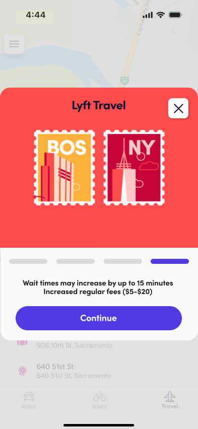
Key Design Elements
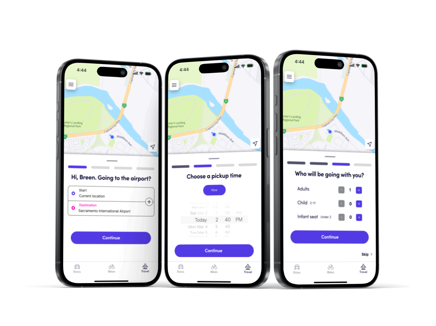
A pop-up will pull users into a focus screen, informing them how the new travel feature functions. I wanted to keep this short and sweet as I assume most people will not read this or lightly skim it. After the focus screen, you enter the new four-step process for selecting where you’re traveling, when, who is coming with you, and what you are bringing. I wanted to ensure users could see how long this process would take and which step they were on.
UI Assets
I created another frame on the UI Kit page that contained the assets I would use in my designs. This allowed me to develop components with styles throughout the design. Doing this early on streamlined the entire process.

Prototype
First Flow
The first flow involves a family of four planning a trip for the future. I designed it to test how well the click-through design would work for travel plans that incurred many selections. When traveling with a family of four, you will likely need to engage with every level of the added feature. I wanted to focus on how the pop-up focus window worked for users. The success metric for this flow would consist of the completion of the task, ease of the process, and time to complete.


Second Flow
The second flow was designed to be a single traveler calling a car to the airport immediately. This is a very likely scenario when it comes to rideshare apps. This scenario is bound to happen countless times throughout a single day and is important to test. The success metric for this flow would consist of the completion of the task, ease of the process, and time to complete.

Test & Iterate
Unmoderated Usability Testing
I wanted to understand how the two original flows worked, so I created an unmoderated usability test using Maze. I had 11 total participants. I split the first flow into two sections to make it easier for the user and to determine the pain points more accurately.
Scenario 1: Your family (you, your partner, and your two young kids) are planning an upcoming trip. You have decided to use Lyft's new travel Feature to pre-book your ride to the airport.
A major pain point was discovered when locating the travel feature.
This could be due to people expecting to use Lyft as they usually would.

Scenario 2: Your family (you, your partner, and your two young kids) are planning an upcoming trip. You have decided to use Lyft's new travel Feature to pre-book your ride to the airport.
Many of the misclicks in this flow point to a problem with the flow itself more than the screens; I need to try and rework the flow to allow for alternate paths.
People noted that they would use this feature if they had a lot of people or oversized luggage, and this was easy to use.

Scenario 3: You are a fitness instructor who has a business trip and is taking a Lyft to the airport. You will need to transport your oversized fitness machine and two bags.
Two people said they would not utilize this feature because it would take too long.
Someone was confused about how this differs from Lyft (which is positive for an added feature).
There was confusion about selecting a car.

Key Takeaways
Moderated Tests are a must.
In the moderated tests, the flows need to function much better, and the story needs to be more detailed.
People were generally confused using the feature, and the information page did not ease the confusion.
Think about the wording of “travel”.
Make another flow from point A to point B to show it is not just about the airport.
Work on how icons appear usable and when they shouldn’t (the on/off function).
Make sure that the choice of a car option makes sense. There should now be times on the scheduled cars (or it needs to be clear that the waiting times will vary based on the choices).
1st Iteration
I changed the information blurb across all screens to be more detailed, hoping to alleviate confusion about the added feature's general function. This was a tough choice as the travel blurb now contains a lot of information that users might not be keen to read.


Moderated Usability Testing
I conducted four moderated usability with participants aged 30 - 49. My main goal was to determine the pain points throughout the added feature. I also wanted to learn how the UI design integrated with Lyft’s current platform. I conducted the test using the same two task flows as the unmoderated test.
Findings 1: Users felt that the option to skip should not exist. There is the option to close out of the blurb and skip; this was redundant and unnecessary. Including a skip button would encourage people not to read the info blurb, confusing them later.
I also confirmed my assumption that this screen had too much information. Most participants said they read the first line and then clicked continue. Later, this created a pain point when users were unaware that the fees could be slightly increased when using the added travel feature.

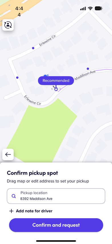
Findings 2: Users were confused by the car selection screen. When planning a future trip, the flow ends on this screen, where you can see the estimated arrival time of multiple car options. This did not make sense as participants had already selected a future time to travel.
This screen required a redesign that worked to incorporate the changes the feature created. After going through the process of informing Lyft of your travel parameters, you should be given one option to meet your needs. This needs to be represented by this screen.

Key Takeaways / Next Steps
Remove the skip button.
Consider the car choices - currently, Lyft has it, so you have one option when scheduling a ride.
Consider how to present the travel blurb in a more user-friendly way.
Clickable info buttons
Smaller tidbits of information provided over the flow
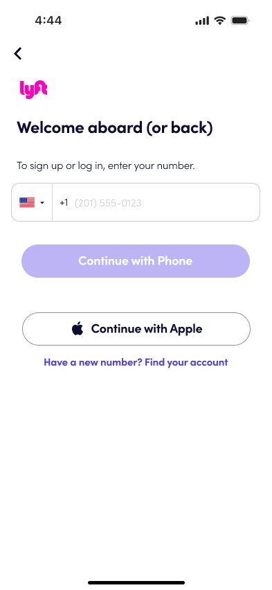
Ensure the code entry on the phone verification is automatic and does not require you to click the purple button, as this is something else.
Create another flow so it is clear the airport is not the only use.
Key Changes
The biggest change I made was how the feature was introduced. It started as a small info blurb, and then more text was added to clarify the new feature. This detracted from the user experience and I needed to redesign this key component. I separated the information across four screens, and while a user could easily click exit any time the call to action remains on continue.


Final Design


Next Steps
Final Thoughts
I would work to simplify the car selection screen, I was trying to stay in line with current Lyft practices by allowing the user to choose the car at the end. My goal would be to find a new way to present the car selection process entirely. I would then work to get my design ready for hand off.
I really enjoyed creating a project that needed to align with a previously set UI design. It was both challenging and fun to work to create a feature that fits with Lyft’s current branding. It was an excellent learning experience to dive into User Research around Ride Share apps as this is almost a universal experience in the world at this time. I would love to continue to research and design apps that people are using on a daily basis.