
Capture
End-to-end mobile app

Background
IPhone users love to take photos to preserve their memories, but almost everyone believes they have room to improve. The Capture app will educate users on how to take better photos via their phone's camera. It will be a fun way to spend a small amount of time daily (or based on the user's time preferences) to learn tidbits of information that, put together, will improve it’s photos.
Problem
Everyone with a smartphone is an amateur photographer, using their phones to preserve memories. Not everyone has the skills to take good (or even great) photos.
Solution
Create an ed-tech mobile app that teaches users photography in small chunks of time. The app will have a gaming aspect to it to increase user retention and enjoyment.
My Role
End-to-end UI & UX Designer
Timeline
80 Hours*
Tools
Figma, Google Suite, Canva
*Redesign
During my usability tests towards the end of the design process, I concluded that the MVP was not up to my set standards. I felt I drifted away from the original concept and where my research had led me. I noted in testing that users did not understand a lot of the app; while they liked the idea, they did not feel it was an app they would use, so I decided to take ten more hours to redesign the app, trying to create a product that would entice and excite users. This is the result; keep reading to see how I get there.


Empathize
Ed-Tech Breakdown
The toughest part about the competitive analysis for Capture was finding other photography education apps to analyze. I was able to focus my analysis on four different platforms that were designed to educate users on photography. PhotogMaster app was the closest option to a photography app but was extremely outdated. Udemy is a wide skills learning site, and there are a few options to focus on for photography.

Key Takeaways
There is a wide lack of ed-tech apps for photography.
There are not currently any apps teaching photography that are doing well.
Photography apps do exist; some are outdated, and others are new with limited features.
Photography apps that are currently available on the app store have poor UI features, making them hard to use.
There are many options for courses you can take on sites such as Udemy, these are a one-time purchase.
There is a gap in the market for a photography learning app.
Survey
Sixteen participants
Majority aged 25-34
About 67% of the survey participants were women (12)
The majority of the people who took the survey lived in California
All survey participants are iPhone users
All users use their iPhones to take photos, with three participants using a DSLR camera and 2 using a film camera

What do you most often take photos of?

How much time would you commit a week to learning to take better photos?
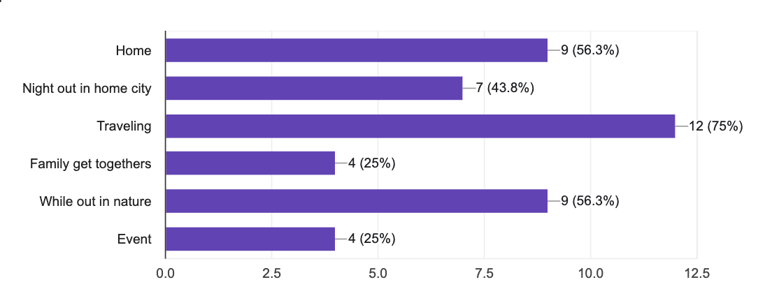
Where do you most often take photos using your phone?visit a bookstore website.
Key Takeaways
The majority of the survey participants are using iPhones as their mobile devices. Therefore, I can move forward with an IOS-based app. All users believe their phone photography can be improved and are willing to commit weekly time to do so. This confirms the assumption that there is room in the edtech industry for an iPhone Photography app. Most users prefer to take photos of their pets/people and in nature. The app will incorporate these genres of photography and should be featured in the MVP. The industry is largely subscription-based, and the developing app will likely follow suit.
“What do they say? A picture is worth 1000 words”
Interviews
5 participants
Majority aged 30-65
All of the interviewees were women
Conducted two interviews in person and three over zoom


Key Takeaways
The biggest takeaway from the affinity map was seeing the important overlap between why people take photos and what they take photos of. Every single participant said that the main reason they take photos is to preserve a memory. Social media plays a small role in the driving force of iPhone photography. This will allow me to focus the project on improving photography for the user alone without a large social media tie-in. Another key takeaway is that everyone believes they have room to improve and is willing to do so. I also determined the main areas of interest to be people, places, and pets. I determined that some categories, such as food, will be featured but likely not active in the MVP. I have also determined that around half the users likely use photography for personal business purposes; this is a category of photography learning I had not yet considered.
Define
Storyboard
One of the biggest challenges I have faced while designing this application is the lack of comparative apps. I decided to create a storyboard to visualize when users will be using this app. I wanted to empathize with people's experiences that landed them on the app. This helped me to determine what the feel of the app should be.

The Stories

The first story follows Weston, who loves to take photos of their food - but they never feel like the photos capture just how good their food is. Their friend Easton tells them about a new app they’re using that is teaching them to take better photos of food. Weston downloads the app and is grateful when they see their food photography start to improve. This story shows how Capture can help users improve their daily photography skills.
The second story follows Cullen, who is thinking of getting some photos printed and framed as a present to their mom. Cullen feels sullen by the lack of skill they see in their photography. Cullen hears about this new app designed to help improve daily photography skills. They download and take a quiz that helps the app determine where they fall regarding skill. Cullen is happy when they can print photos for family as holiday gifts.
Feature Roadmap
I continued to be challenged by the lack of comparative apps when creating a feature roadmap, which allowed maximum creativity. I could think outside of the box about what features this app would be made up of. If I had unlimited time, it would have been amazing to see all three options in the surprising and delightful category come to life, but I had to focus on the overall concept of the app. With this, the app's actual learning process was crucial to the MVP.


Sitemap
The app's main focus is to help you learn better photography skills. Therefore, coursework will take up the bulk of the space. I wanted to show this through the sitemap; my original concept was to have only one “level” freely accessible, with the rest of the site behind a paywall, as shown below. Once you buy in, you can access many more basic to advanced levels.


Design & Ideate
Something from Nothing
The entire sketching process proved to be quite difficult, getting in line with the project so far. With nothing to draw ideas from, I was left to create as many concepts as possible and then go from there. I had a particularly difficult time trying to come up with the concept for the homepage as well as the course’s main page. I had a few ideas that you can see below, a grid as well as an alternating path similar to Duo Lingo.


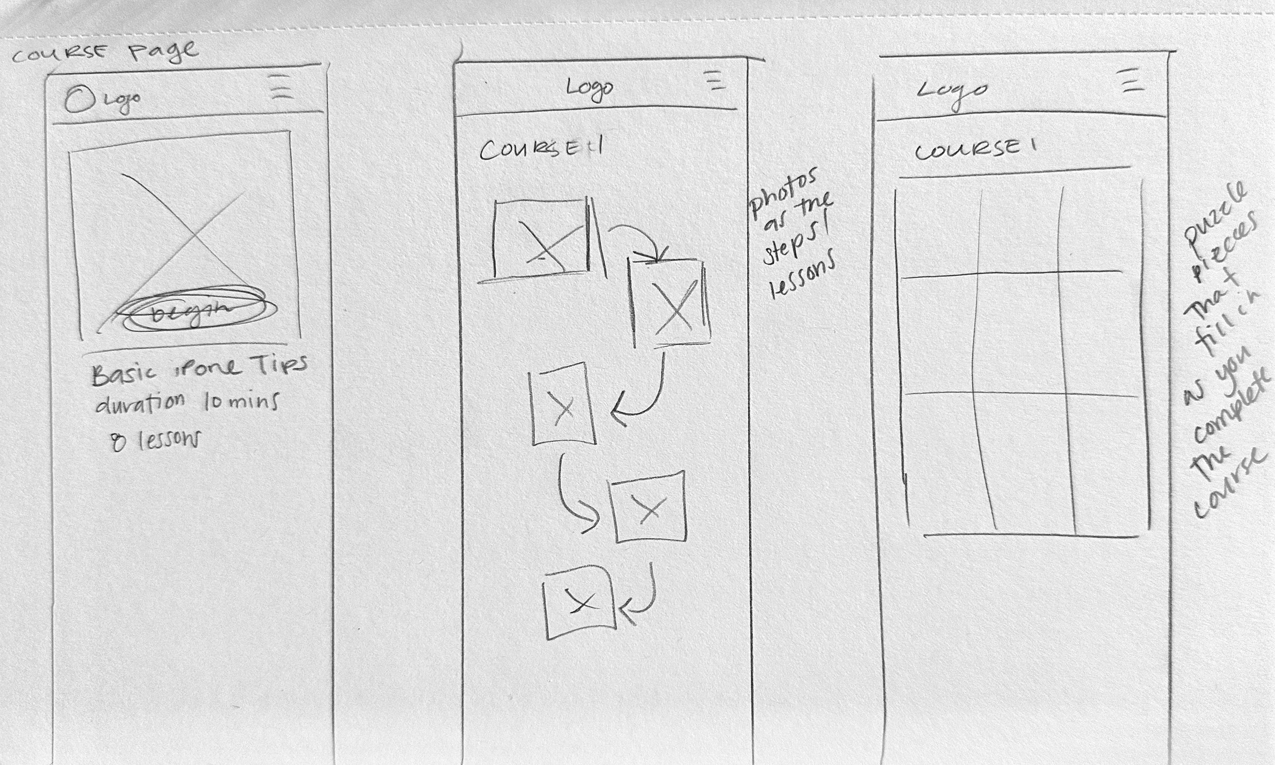

MidFidelity
During sketching, I devised an idea to “gamify” Capture by having users earn puzzle pieces as they completed levels; the pieces would eventually assemble into well-known photographs. You can see this process come to fruition in the mid-fidelity screens. I also focused my learning screens on basic iPhone photography settings, which I had laid out in my sitemap.


UI Kit and Branding
When you think of photography, you can’t help but think of nature; I wanted to create a branding kit that emphasized the calming feel of nature. I went with dark greens to bring the user into the feel of a forest, with a soft orange as my secondary color. This will be used for buttons and other call-to-action points. The AI icon will be essential to the app, so I wanted to include it in my UI kit.

High Fidelity
I included many screens at the beginning to explain how the AI feature (Cam) could be utilized. I imagined users would need to understand exactly what Cam did from the beginning to ease the process later on. I included the first level, free to new users, to show the learning process. Specifically, this first level would help users set up their iPhone camera settings to ensure a smoother learning process. This would also show how users would earn puzzle pieces for completing levels.


First Prototype
Three Flows
I created three flows for usability testing. The first was the primary onboarding process, which was easy as I based it on using Face ID to sign up for an app. The second would be to complete level one of the course - Basic iPhone Photography Settings. This flow took users through a lengthy learning process consisting of several screens. This flow would show an early level with the primary goal of having users turn off live photos. This flow helped me test how the learning process worked and whether the gamified puzzle pieces added anything. Finally, the third flow would be to access the profile and community features. The last flow is free-flowing and designed to familiarize users with the community aspect of the app; that way, I could test its value to the app.


Test & Iterate
Moderated Usability Testing
I conducted three usability tests remotely through Zoom with participants aged 23-27. I did not intend only to test young adults, but it worked out that way; the app would likely target a younger generation that spends a lot of time on their phones, so it worked. This allowed me to have the user share their screen and verbally let me know what they were doing. I could locate the pain points in real-time and ask essential questions.
Findings 1: Users were also confused by the Cam, thinking that its purpose was to function like the paper clip in Microsoft Office - this made it clear to me that the redundant screens explaining Cam were not serving a purpose. Adding multiple screens for users to “understand” Cam was not working; it likely had a reverse effect. Participants wanted to skip through these screens and were likely to make assumptions about the AI function and possibly not use the feature later.
Findings 2: I noticed early on that users did not understand the puzzle piece addition to the app. Users were confused by its purpose and did not think it added anything to the app. While it sounded fun to earn puzzle pieces, there was no larger goal, and it did not connect to photography. This was a nice idea, but it was not adding anything to the app. The puzzle piece design failed to blend with the overall look and feel of the design as well.

Findings 3: It also became apparent that the learning process was far too long, and users were confused about why they would need to learn how to turn live photos off in three different ways. One user noted this may be useful for very old users, who are likely not using this app. It became clear that showing users how to turn off live photos was also quite boring. It was not necessarily a skill that needed to be learned, more like house keeping. This would likely not attract new users or result in the app creation.
Next steps
Change the gamified design and keep the concept as ed-tech does well with gamified, but look into other ways to cover it.
Think about the function of the AI feature. Cam doesn’t need to be explained; users can learn the function of the feature as they engage with the app. Keep it a bit mysterious.
Limit the amount of learning screens per level.
Present the information in chunks to help users learn.
Change the UI - users would not use the app.
Use the UI to draw users in, think about gamifying the overall branding.
*Rather than continuing with usability testing that would likely yield similar results, I needed a redesign. At this point, I decided that the home screen and the gamified design needed an update.
REMIX - Back to the Drawing Board
New Branding
I imagined the entire app would be in dark mode as most physical cameras are dark; when you shoot with a true camera, your eye is in a dark tunnel. The iPhone camera mirrors this by having the entire app designed around in dark mode. I wanted to mirror this concept in my designs. I also switched to a more fun and whimsical color scheme. The goal is to keep learning fun. I achieved this by sticking with dark greys, dark blue, and white as the primary colors of the app. I then used five bright, captivating colors as the “Secondary” color.

Out with the Old
As I was trying to redesign the course home screen, I realized I had drifted away from my original concepts; I was scared that I could not achieve my ideas.
I still wanted the app to be gamified, as this is a common practice in ed-tech, but I needed to move away from the puzzle feature. I did more research to determine common game categories, such as badges and streaks. These are intended to keep the user coming back.


In with the New
As I was redesigning Capture, I noted that the first flow - The Onboarding Process- was unnecessary for the MVP. I wanted to create another easy flow to replace it. So, I created the “Examples” Feature. This will show examples of a lesson that helps the user understand The Rule of Thirds better.
Test & Iterate - Again
Moderated Usability Testing


I conducted two more usability tests remotely through Zoom. The testing script remained almost exactly the same, but the flows themselves were very different. These flows wielded vastly different results. Users were able to move through the flows with ease and delight. There virtually no pain points.


The app felt incredibly usable to participants.
The overall feel of it was attractive.
Users said they would want to try it out the app, some saying the would download it right now if they could.
The app was much closer to the original concepts and stuck to the research gained at the beginning of the design process.
Key Takeaways
Next Steps
Final Thoughts
The next step in the process would be to start to develop the AI feature more, as this would be a selling point of the app. The idea is that Cam would be there to guide the user in their learning, letting the user open the camera app through Capture and Cam would help the user remember what they have learned in real time, commenting on what the user is seeing and how it is being framed.
When I finished my first round of prototypes I did not believe I was looking at my best work. It was imperative to me that the project reflected my potential. I made the decision to take an extra 10 hours to redesign the project from the ground up - letting the fun and educational nature of Capture shine.